Illustrated Graphs: Using Art to Enliven Scientific Data
lesson
212 Downloads
Write a review
beta
EdBrAIn It
EdBrAIn uses AI to customize lesson resources for your students’ needs.

Illustrated Graphs: Using Art to Enliven Scientific Data

Share

Share On Facebook
Share On Twitter
Share On Pinterest
Share On LinkedIn
Email

About This Lesson

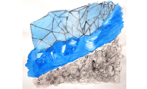
Artist and scientist Jill Pelto combines art with scientific data to raise awareness about climate change. In this watercolor, called Habitat Degradation: Ocean Acidification, the subtle line graph depicts changes in ocean acidity level over time. By enlivening it with illustration, she tells a story about the effects of decreasing pH on the ability of clownfish to navigate, avoid predators, and process information.  

For many of us, envisioning the profound effects of climate change is hard to do without relatable examples. By illustrating specific aspects of climate change research, Pelto provokes viewers to question, wonder, and want to know more.​

In this exercise, you will select a scientific graph that addresses an important real-world issue, create an illustrated graph from that original, and craft an effective artist’s statement that connects the two. Once you’re done, keep an eye out for other ways you can merge science with art. The possibilities are endless!

Resources

Files

beta
EdBrAIn uses AI to customize lesson resources for your students’ needs.

GlobalCarbonEmissionsfromFossilFues1900-2011.pdf

February 13, 2020
98.19 KB
beta
EdBrAIn uses AI to customize lesson resources for your students’ needs.

SeaLevelRise1870-2000coastaltidegaugedata.pdf

February 13, 2020
105.09 KB
beta
EdBrAIn uses AI to customize lesson resources for your students’ needs.

AtmosphericCarbonDioxideLevelsDuringLastThreeGlacialCyclesindirectmeasurement.pdf

February 13, 2020
137.71 KB
beta
EdBrAIn uses AI to customize lesson resources for your students’ needs.

SeaLevelRise1993-Presentsatellitedata.pdf

February 13, 2020
87.38 KB
beta
EdBrAIn uses AI to customize lesson resources for your students’ needs.

AverageSeptemberExtentofArcticSeaIcesince1979.pdf

February 13, 2020
97.09 KB
beta
EdBrAIn uses AI to customize lesson resources for your students’ needs.

GlobalSurfaceTemperaturevs.SunsEnergyReceivedattheTopofEarthsAtmosphereFrom1978to2009.pdf

February 13, 2020
171.83 KB
beta
EdBrAIn uses AI to customize lesson resources for your students’ needs.

AntarcticIceMassVariationSince2002.pdf

February 13, 2020
96.82 KB
beta
EdBrAIn uses AI to customize lesson resources for your students’ needs.

ClimateChangeGraphPacket-1.pdf

February 13, 2020
513.66 KB
beta
EdBrAIn uses AI to customize lesson resources for your students’ needs.

AtmosphericCarbonDioxideLevels2005-Presentdirectmeasurement.pdf

February 13, 2020
83.36 KB
beta
EdBrAIn uses AI to customize lesson resources for your students’ needs.

GreenlandIceMassVariationsince2002.pdf

February 13, 2020
90.1 KB
beta
EdBrAIn uses AI to customize lesson resources for your students’ needs.

GlobalLand-OceanTemperatureIndex.pdf

February 13, 2020
140.35 KB

Reviews

Write A Review

Be the first to submit a review!

Advertisement